noc.
Evolving the noc brand from a minimalist café known for curation into a more emotionally resonant experience rooted in slowness, warmth, and cultural relevance.
Year
/
Repositioning a Familiar Brand
(01)
From minimal objects to meaningful experiences.
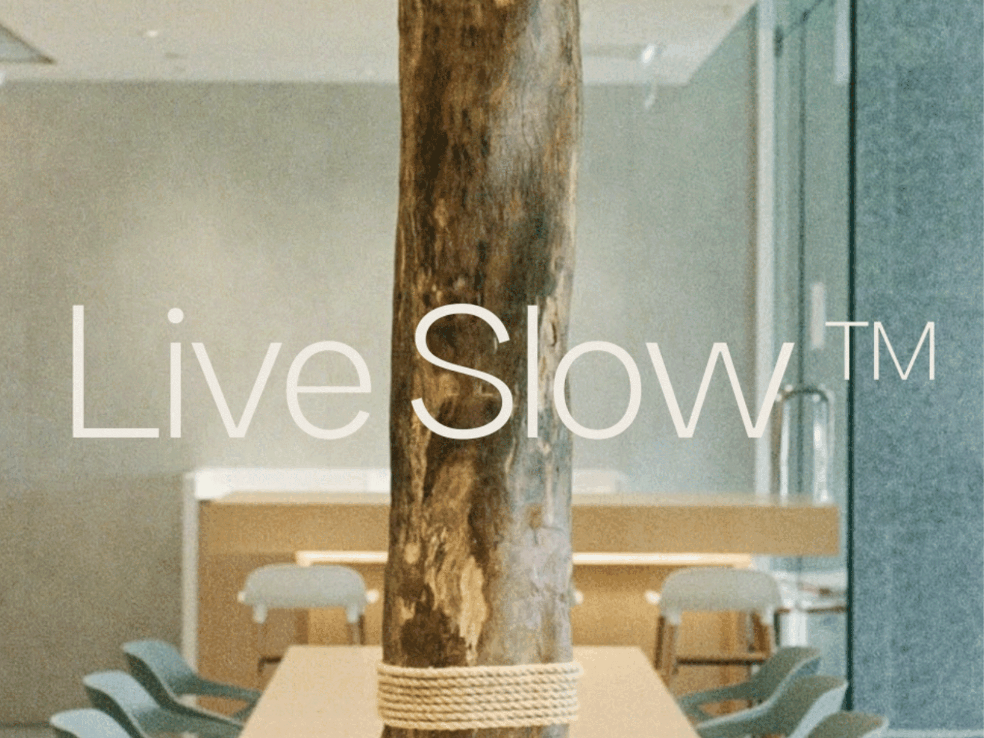
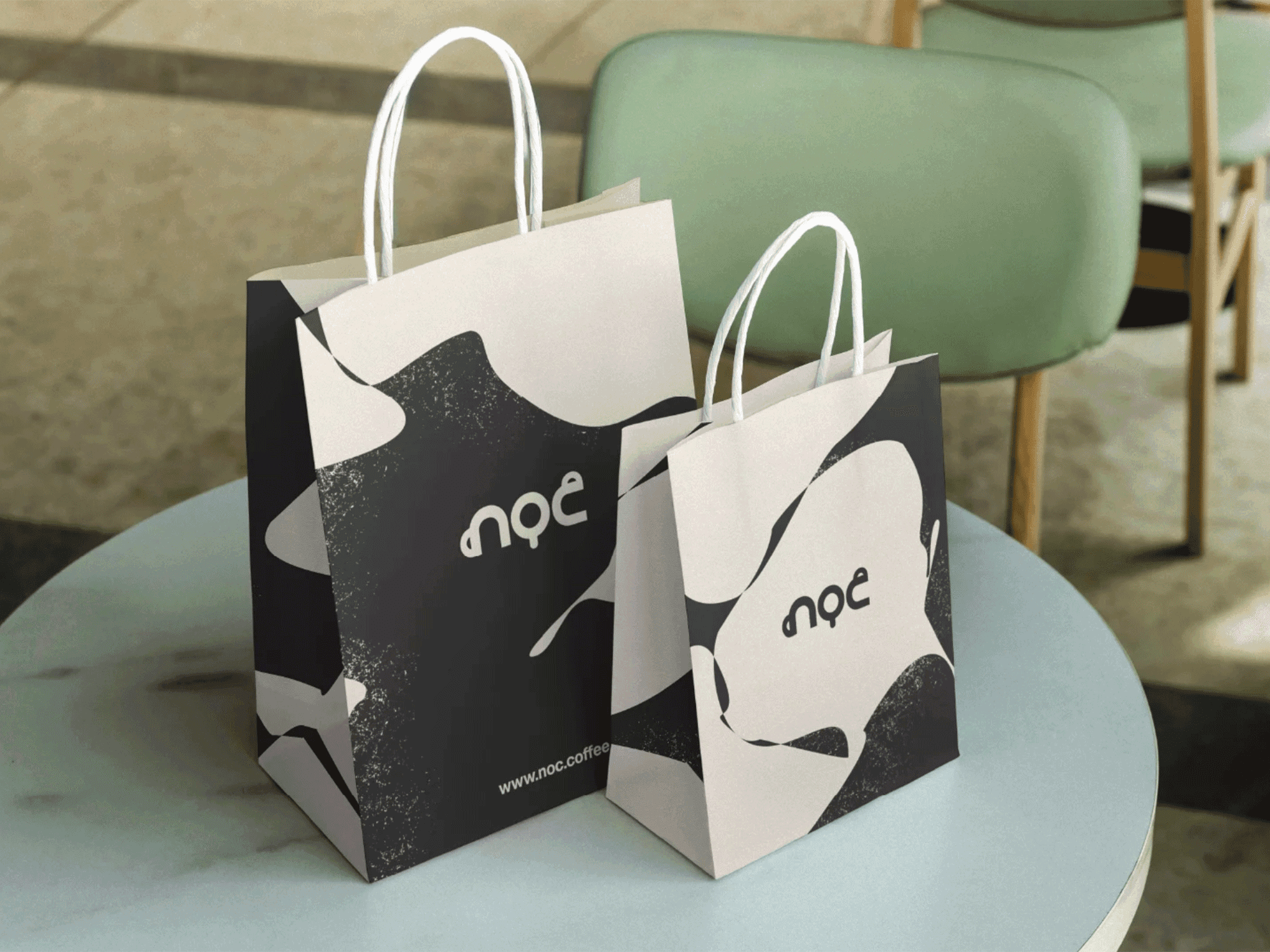
Despite a strong reputation for thoughtful design and precision-crafted coffee, I've always thought noc's stripped-back aesthetic risks blending into a now growing field of imitators across Asia. I helped reimagine noc’s identity around a new brand idea — Live slow — positioning the café as a counterpoint to the pace of Hong Kong city life. This idea became the foundation for a broader brand platform, aligning their visual identity under a shared philosophy of calm and intention.


/
Bringing “Live Slow" to Life on Film
(02)
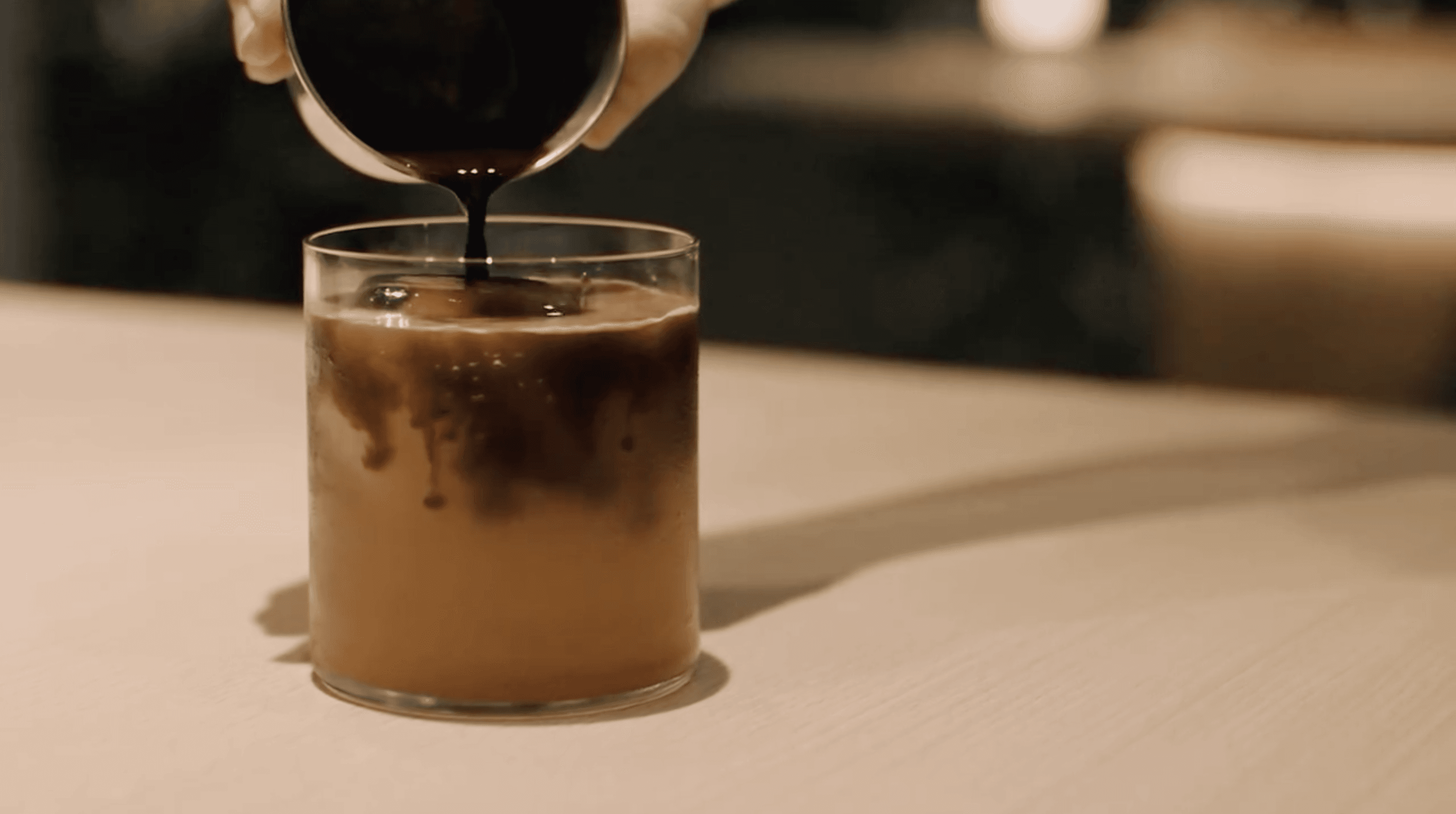
Using motion to express feeling, not noise.
As part of the refresh, I helped sound design, color-grade, and edit a brand video designed to capture the emotional core of Live slow. Rather than focusing on product or scale, the promotional film emphasized movement, texture, and quiet moments — coffee filling a cup, hands in motion, light passing through space. The video reached over 15k views and contributed to roughly a 50% increase in followers on the noc Instagram page.


/
Reflection
(03)
Why simplicity needs purpose.
noc’s refresh reshaped how I think about minimalism in design. The project made it clear that stripping things back isn’t inherently meaningful — without intention, minimalism can quickly become generic or empty. Live slow wasn’t about doing less for the sake of it, but about choosing what mattered and giving it room to breathe. Instead of pursuing minimalism as a look, how elements felt became the focus — warming the color palette, softening contrasts. In the video, this meant lingering shots, slower transitions, and an emphasis on texture and rhythm, allowing restraint to feel intentional and emotionally grounded rather than sparse or empty.