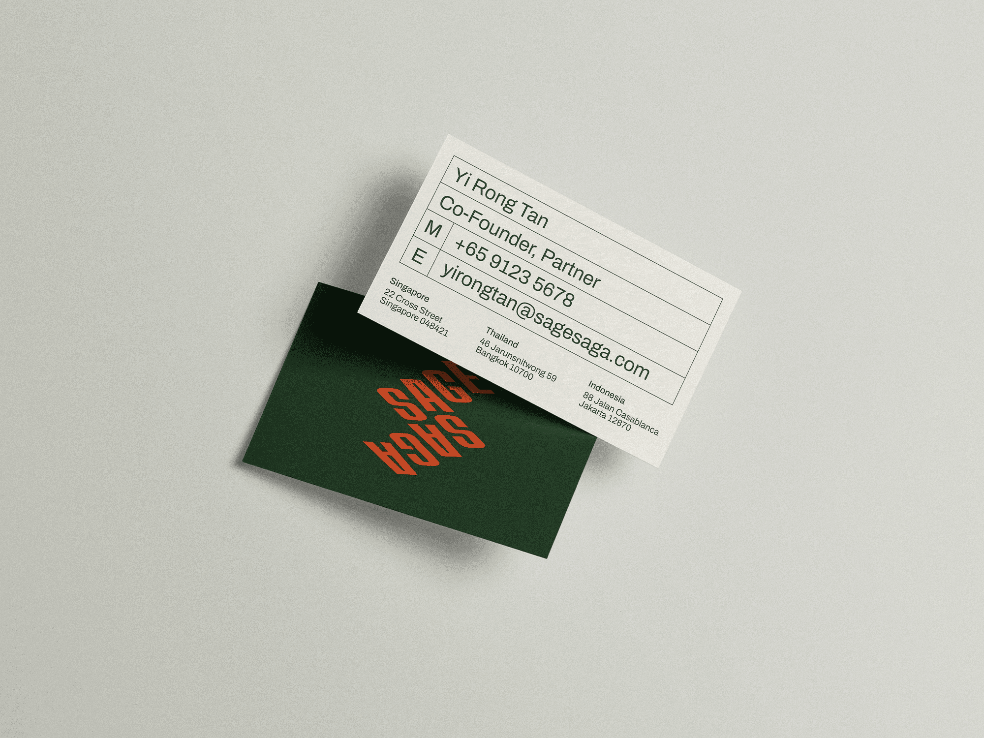
Sage & Saga.
Sage & Saga is a Singapore-based growth consultancy and venture studio in the process of defining its identity. This project focused on creating that 0→1 brand identity, defining the name, visual system, and touchpoints to reflect a balance between strategic clarity and narrative depth.
Year
/
Starting from Nothing
(01)
Designing a brand without shortcuts.
The challenge with Sage & Saga was building an identity entirely from a blank Figjam file with no existing visuals or established constraints. The consultancy needed to stand apart from a landscape dominated by neutral palettes and generic minimalism, while still feeling credible and strategic. From the beginning, the focus wasn’t on designing a logo, but on figuring out what the brand actually stood for — a balance between rigorous thinking and human storytelling.


/
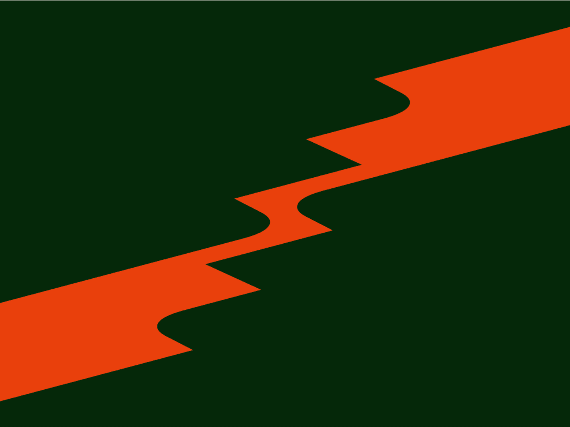
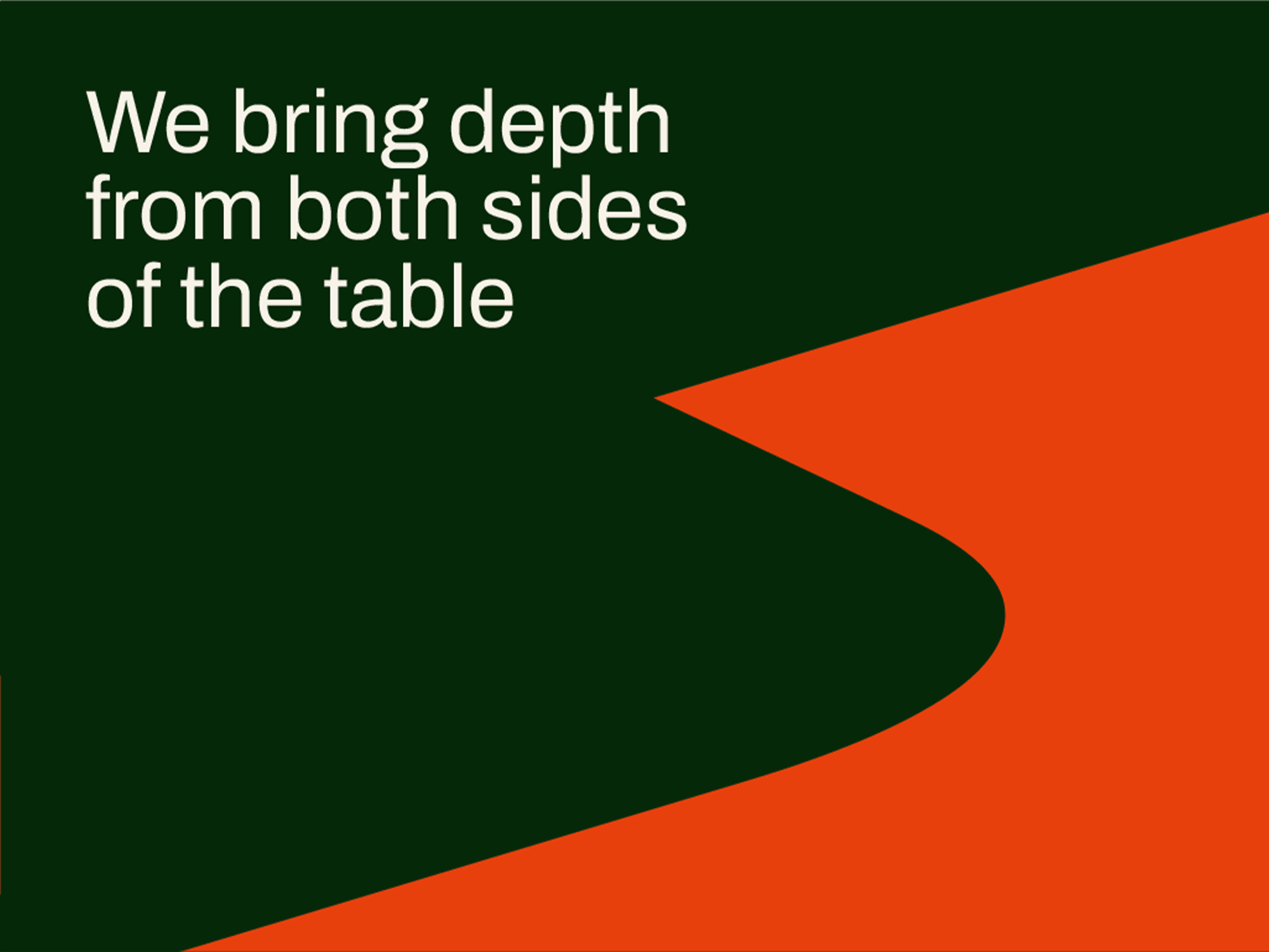
Two Sides of the Same Story
(02)
Where wisdom meets narrative.
The identity centers on the idea of duality. Sage represents wisdom and grounded thinking, while Saga represents narrative and long-form vision. This took shape through a bold brand graphic that suggests tension between two perspectives, and the color palette and typography were designed to feel warm yet disciplined.
/
Reflection
(03)
Minimalism as an outcome, not a goal.
This project changed how I think about simplicity in design. I usually try to be minimal right away, but with Sage & Saga I had to let the idea stay messy for much longer than I was used to. Spending time unpacking the story, references, and tensions made the final steps of simplification feel more natural instead of forced. The logo and system may look restrained, but there’s a lot underneath them. It taught me that the best kind of simplicity comes from understanding, not restraint for its own sake.

